
Showing posts with label Paul Mitchell. Show all posts
Showing posts with label Paul Mitchell. Show all posts
Wednesday, 23 September 2009
I am Moving!
My new Blog Homepage address is http://p-mitchell0811.blogspot.com There wont be any more posts to this blog but it will stay as a record of my year one work.
Sunday, 31 May 2009
Speaking from experience, Mapping Leeds
For the final brief of the year I decided to create mapping of Leeds to help next years, year 1 intake on my course. I have never tried info graphics before so I admit this was partly an excuse to experiment with something new. I decided quite early on that I wanted to create a map that was detailed but with as little clutter as possible, having street names was really something that I wanted to avoid even though this would impact on how useful the map might be. My reasoning was that high quality, detailed mapping with all this information is easily available for free on the internet (Google Maps being the best as it combines so much information with actual satellite images). I knew to be effective I had to create something different from this so I decided to make a visually appealing map that would look good as a wall poster, but would also serve to highlight places of interest to new students. I also experimented with a smaller scale version with modified graphics to be use as a pocket guide, this in the end proved to be problematic as I felt It would not have either been as useful as a map or as visually appealing as the larger scale version so deciding that there was no real point in its existence. I abandoned this mid way through development and stuck with the A2 poster design for my final resolution.
So then, as most of my time of this brief was spent refining and developing my map, I thought it would be good to share some of this process on this blog.

1) This was quite an early version but already I had made some decisions that were carried right through to the final resolution: To create a contrast between the roads and the river I used strictly angular connections for all roads and curves for the waterways. The thickness of the roads looked far too heavy and even if you know Leeds there is little in the way of obious points of reference here to help you find your bearings, so I knew I had to add much more detail somehow.

2) More detail added, including all the roads in the maze that is Hyde Park! I felt at this stage it was defiantly coming together well and the basic graphical style would work, this colour scheme also worked far better than the magenta roads I first imagined. Having two thickness for the roads defiantly worked better than one as the concept of major and miner roads is well engraved into our minds when we think of places and directions.

3) Even more detail added: Again the idea for a dotted line for a path is well understood so I Incorporated this in the city center pedestrianized area and also on parkland. The railway line was also something I wanted to add because it is a strong reverence point, but I didnt see the point in adding just one station so I wanted to make sure them map extended enough to add Burley station as well. This was the main reason the map includes so much of Hyde park, but as I was already thinking about tilting the map to show perspective I knew the Hyde park area would appear smaller in the final version. I thought hard about if I should include the main ring road as it is pretty irrelevant to students who walk around Leeds, but in the end I drew in in with semi transparency as it does serve as another point of reference to finding places in relation to each other in the city, I also dotted the underground section of this.

4) I didnt really want to add more colours that was strictly necessary, but adding in parklad as green really helped highlight Hyde Park, which is a major student landmark in Leeds, I also added the old British Rail logo for the train stations, cheeky yes, but its still universally understood and seemed to sit well on the map as its a simple angular shape. Also you can see places being added as dots here.

5) Another colour change: After a good hard look at the work to date, I decided the orange just wasn't doing it for me so I changed the roads to a mid gray, obvious choice really as this is the colour of actual roads.

6) Final Map! I know this doesn't really work at this scale as it has been designed to be viewed close up as A2 scale but you can get the idea. Tilted back into 3D with tagging done lightly so not to distract from the map graphics itself. There are student halls, pubs/clubs and also some course related sites tagged as these were the places that my survey reveled this years students wanted to knew the way to when they started on the course. I did originally title it 'Leeds' but the I though that was pointless as it was never going to be anywhere else if it was given to students at a Leeds college, so I went with the minimal 'Map' as the title.
So then, as most of my time of this brief was spent refining and developing my map, I thought it would be good to share some of this process on this blog.
1) This was quite an early version but already I had made some decisions that were carried right through to the final resolution: To create a contrast between the roads and the river I used strictly angular connections for all roads and curves for the waterways. The thickness of the roads looked far too heavy and even if you know Leeds there is little in the way of obious points of reference here to help you find your bearings, so I knew I had to add much more detail somehow.
2) More detail added, including all the roads in the maze that is Hyde Park! I felt at this stage it was defiantly coming together well and the basic graphical style would work, this colour scheme also worked far better than the magenta roads I first imagined. Having two thickness for the roads defiantly worked better than one as the concept of major and miner roads is well engraved into our minds when we think of places and directions.
3) Even more detail added: Again the idea for a dotted line for a path is well understood so I Incorporated this in the city center pedestrianized area and also on parkland. The railway line was also something I wanted to add because it is a strong reverence point, but I didnt see the point in adding just one station so I wanted to make sure them map extended enough to add Burley station as well. This was the main reason the map includes so much of Hyde park, but as I was already thinking about tilting the map to show perspective I knew the Hyde park area would appear smaller in the final version. I thought hard about if I should include the main ring road as it is pretty irrelevant to students who walk around Leeds, but in the end I drew in in with semi transparency as it does serve as another point of reference to finding places in relation to each other in the city, I also dotted the underground section of this.
4) I didnt really want to add more colours that was strictly necessary, but adding in parklad as green really helped highlight Hyde Park, which is a major student landmark in Leeds, I also added the old British Rail logo for the train stations, cheeky yes, but its still universally understood and seemed to sit well on the map as its a simple angular shape. Also you can see places being added as dots here.
5) Another colour change: After a good hard look at the work to date, I decided the orange just wasn't doing it for me so I changed the roads to a mid gray, obvious choice really as this is the colour of actual roads.
6) Final Map! I know this doesn't really work at this scale as it has been designed to be viewed close up as A2 scale but you can get the idea. Tilted back into 3D with tagging done lightly so not to distract from the map graphics itself. There are student halls, pubs/clubs and also some course related sites tagged as these were the places that my survey reveled this years students wanted to knew the way to when they started on the course. I did originally title it 'Leeds' but the I though that was pointless as it was never going to be anywhere else if it was given to students at a Leeds college, so I went with the minimal 'Map' as the title.
Saturday, 30 May 2009
OUGD103 Module Evaluation
What skills have you developed through this module and how effectively do you think you have applied them?
Looking at the work I have produced for this module, I defiantly think it is the best work I have produced so far on the course. I actually dont think I have learnt as many new skills this module, but I have certainly used the skills I have learn throughout the first two modules in far better ways and built on these to a great extent to produce this body of work. I am constantly surprised of often I turn to illustrator now as it was a program I hated when I first tried it. The type and grid brief was where I learnt most skills I think this module, this was quite educational and gave me a new perceptive on how papers and magazines are put together. It was great to have Lorenzo teaching this as he is clearly extremely experienced at doing grid based layouts, I found if I quizzed him about one point he would also tell me another five tips, trick and cheats that he uses which were fantastic to learn.
What approaches to/methods of research have you developed and how have they informed your design development process?
On this module I think I have used used research quite effectively. I have defiantly learnt the value of doing a quick questionnaire to gather opinion and ideas (but sadly so has the rest of the year so there was quite a lot to fill out some days! I have started to ask around more when needing other designers work for research as there is always someone who has seen exactly what you are looking for. I am still on track in buying one good book per module for my own collection (this time the brilliant Data Flow which helped my mapping project a great deal and will be a source of inspiration in the future i'm sure) Creative revief has also been a good companion recently thanks to its quality content mixed with a cover price the right side of ridiculous unlike others in the segment (I'm looking at you 'eye'). So I think all in all I am a lot more informed than ever before as a designer even if a lot of this influence has be subconscious rather than direct.
What strengths can you identify in your work and how have/will you capitalise on these?
I think my project and time management has been far better in this module, I think this is as a result of more practice doing design work as well as a conscious effort to plan ahead. I now have a far better idea how long certain tasks will take me.
What weaknesses can you identify in your work and how will you address these more fully?
I think sometimes I feel there is a general lack of ambition in my work, I still play safe to complete a brief competently rather than risk something that might end up spectacular (or spectacular bad) I think this is something I will reflect on over the summer as it is more to do with where I want the course to take me, but I think I have made progress in driving a couple of the briefs rather then letting them drive me, and this has resulted in better work and less stress. The final mapping brief went exceptionally smoothly and I did what I set out to archive as well as experimenting with something which is new to me. I think the reasons for this were having a clear goal from early on, having enough time set aside to experiment and learn as I went along.
Identify five things that you will do differently next time and what do you expect to gain from doing these?
1 - Proof read design sheets.
No more T-shits!
2 - Buy a layout pad.
Far too many bits of paper is starting to drive me crazy. I also do have a phobia of working big when I plan and develop ideas but I want to get more comfortable with at least A3 sized paper. At least I am now up to A4 scetchbooks rather than A5 or even A6 that I have used in the past
3 - Stay positive!
I had a bit of a down patch after Easter and found motivating myself very difficult, It has been a stressful year for lots of reasons but I need to remember the achievements I have made
4 - Be more proactive in seeking help and opinions.
At times I have been too quietly on my own rather than going to other for help and advice, the studio environment can overwhelm and stress me at times, probably drinking far too much coffee hasn't helped.
5 - Do some screen printing
I have been meaning to do this all year and not done any, I think the fact that I know it will take up a whole day (that I don't often feel I have to spare) as well as not really knowing how make best use of this has stopped me trying. Not good excuses and I really must do this next year.
Overall I am happy with the progress I have made this module and some of my work has passed my bedroom-wall-test for the first time this year (do I like a piece enough to bluetack it to my own my bedroom wall)
Sunday, 10 May 2009
PPD: examples of interactive design
Well for this PPD task we had to choose 5 examples of designs that are interactive in an interesting way and which might also influence our ongoing Speaking From Experiance brief. These are the 5 I chose..

FedEx t-shirt design
I cant find out much about this design so I'm not sure if its an official FedEx promotion or not, but either way its a great idea for a t-shirt. I am thinking of doing a t-shirt design my my project possibly but something less obvious than a normal print on the front so this got me thinking.

Mondo Pasta ambient advert, Agency: Jung von Matt AG, Hamburg.
This is a great idea for an advert that was placed onto ships in Hanburg harbor. There is defiantly a trend towards this sort of 'ambient' campaigns at the moment, they are defined by a creative use of the existing environment to promote the product. I'm sure I dont need to explain this one!

Heineken Cape Town ambient billboard
Heineken seem to have embraced this style of advertising as I have seen a few simeler to this around the internet, again it interacts with the audience by creating an interesting illusion involving the existing environment. As my Speaking From Experience project involves helping people find their way around Leeds, I have been thinking how I can use the existing environment to my advantage.


Photoshop Eraser T-shirt by Reece Ward
This is an interesting one, I chose it because it would interact well but only with a target audience (Photoshop users) This is approproate to my brief because I want to target next years intake onto my graphic design course. Using a design that only other designers would 'get' might be a cool idea, but has the downside of being quite geeky and introverted. Still, this is a nice idea and works well as a t-shirt design.
(available from: http://www.redbubble.com/people/reeceward only £14.61)

Schulze & Webb 'Here and There' NYC map
Finally my personal favorite. I think this is the perhaps the best map design I have ever seen, it is visually stunning working as both a 3D and a 2D map at the same time. It is also (fairly) practical to use, I have a feeling this will get copied lots, but for now there are just two version looking in opposite directions of Manhattan NY. I am looking at developing more interesting mapping for Leeds but I am not going to try something this ambitious!
http://schulzeandwebb.com/hat/
FedEx t-shirt design
I cant find out much about this design so I'm not sure if its an official FedEx promotion or not, but either way its a great idea for a t-shirt. I am thinking of doing a t-shirt design my my project possibly but something less obvious than a normal print on the front so this got me thinking.
Mondo Pasta ambient advert, Agency: Jung von Matt AG, Hamburg.
This is a great idea for an advert that was placed onto ships in Hanburg harbor. There is defiantly a trend towards this sort of 'ambient' campaigns at the moment, they are defined by a creative use of the existing environment to promote the product. I'm sure I dont need to explain this one!
Heineken Cape Town ambient billboard
Heineken seem to have embraced this style of advertising as I have seen a few simeler to this around the internet, again it interacts with the audience by creating an interesting illusion involving the existing environment. As my Speaking From Experience project involves helping people find their way around Leeds, I have been thinking how I can use the existing environment to my advantage.
Photoshop Eraser T-shirt by Reece Ward
This is an interesting one, I chose it because it would interact well but only with a target audience (Photoshop users) This is approproate to my brief because I want to target next years intake onto my graphic design course. Using a design that only other designers would 'get' might be a cool idea, but has the downside of being quite geeky and introverted. Still, this is a nice idea and works well as a t-shirt design.
(available from: http://www.redbubble.com/people/reeceward only £14.61)
Schulze & Webb 'Here and There' NYC map
Finally my personal favorite. I think this is the perhaps the best map design I have ever seen, it is visually stunning working as both a 3D and a 2D map at the same time. It is also (fairly) practical to use, I have a feeling this will get copied lots, but for now there are just two version looking in opposite directions of Manhattan NY. I am looking at developing more interesting mapping for Leeds but I am not going to try something this ambitious!
http://schulzeandwebb.com/hat/
Sunday, 3 May 2009
PPD Manifesto: What do I want to be as a designer?
What did I used to be?
When I started this course I didn't have that much idea what graphic design was all about, even though it was certainly something I was very interested in. On my foundation year there was very little focus on graphics compared to fine art. I did do some graphic design work but in the end I specialized in photography for my FMP and did consider doing a photography degree. In the end I chose graphic design as I thought I would be doing more varied work that may lead to better future prospects job wise. I have also had a strange love for fonts and have doodled letterforms from as far back as I remember, despite being dyslexic and having issues with actual words. I also like my own work to have a purpose, so this ruled out a fine art direction (at least in its current guise of pointless concepts, BS and self promotion), and led me to be doing some sort of design based course.
Where are you now?
Confused sums up a lot of my thoughts on where I am now. I have worked very hard this year but I cant say I like very much of the work I have done. I question if I am good enough to even be on the course sometimes. I have found less use for my photography on this than I thought I would, and have used far more of Adobe Illustrator than I ever thought I could. I feel I have developed a good critical eye for graphic design, and I do now have a good understanding of the design process, even if my results so far are often not very good. Another surprising thing on this course was my experiences working with others. In the past I have enjoyed group working (on previous jobs and courses) but all three group projects I have done on this course have been absolutely the worst weeks of the year. Maybe graphic designers are just difficult to work with, maybe I have been unlucky, or maybe I am actually the one who is impossible to work with.
Where do I intend to be in the future?
Going into the second year of the course I feel I am far more prepared for what is expected of me. I want to expend on the areas of design I enjoy and pull back and rethink when a brief leads me to be doing things I dislike, as this happened far to often in my first year. I want to develop a sustainable way of working and producing quality work while maintaining a balance in the rest of my life. I realize I am prone to becoming disillusioned and unhappy if I don't feel I have a clear direction and manageable workload. (I am speaking from previous life experience and not just from experiences on this course)
I still want to expand my knowledge and learn new skills in my second year, I am also conscious that ultimately I am doing this course so I can get a job I will enjoy. So I want to start exploring what skills I will need and want to develop that will be useful for industry.
Wednesday, 29 April 2009
Keep Calm and Carry On
This piece of graphic design seems to be everywhere at the moment, amazing that something that was designed 60 years ago seems to have struck a chord today. The sales it is generating is pretty impressive as well according to this guardian article No wonder I am spotting so many around, but I wouldnt have guessed even cufflinks are now available. Its an interesting story how this poster was rediscovered and came to be commercialized, but what is interesting me more now (even more than the celebrity endorsements) it the new variations that I am starting to see.
I have seen a few Now Panic and Freak Out T-shirts around Leeds, but the future direction of this poster can be charted through the designs on http://www.flickr.com/groups/keepcalm/ Yes, a whole Flickr group devoted to variations on this poster.
So then, time for a quick round up,

(the in-joke)

(The Type-Geek)


(The backlash)

(And finally, cleverly pointing out the truth that this poster has now become another office cliche)
I have seen a few Now Panic and Freak Out T-shirts around Leeds, but the future direction of this poster can be charted through the designs on http://www.flickr.com/groups/keepcalm/ Yes, a whole Flickr group devoted to variations on this poster.
So then, time for a quick round up,
(the in-joke)
(The Type-Geek)
(The backlash)
(And finally, cleverly pointing out the truth that this poster has now become another office cliche)
Tuesday, 28 April 2009
Speaking From Experience: Project Proposal
This brief is about giving help and advice to next year's first year students starting on my course. The problems I identified from my own experiences were:
1) How to live on a student buget?
I get money 3 times a year rather than weekly when I worked, budgeting has been essential.
2) How to cope living in halls with other students?
This turned out to be ok (mostly) in my experience but it's something I was very worried about before I moved in!
3) How do you develop the essential skills you need for the course?
Adobe software and marker pen technique.
4) How to be a good student?
Never be late, forget about your social life between holidays.
5) How to find your way around Leeds and avoid getting lost?
We've all done it.
I chose the avoiding getting lost idea because I thought it may bring more scope for interesting work (we shall see).
I am going to make some sort of guide to help new student fond there way around from place to place in Leeds. I was surprised not to be handed this sort of guide myself when I started so I think it will defiantly be of benefit to new students.
To achieve this I am thinking of making a pack which will include a useful sized pocketbook that can be kept in a wallet or purse. Also I think a wall poster will be good, as new students moving into halls are always on the look out for a poster to fill the mass of magnolia you are faced with when you first move in.
Thursday, 23 April 2009
Google Maps Typography
This is really cool and worth sharing, Rhett Dashwood, a Creative Director from Australia has spent his spare time between briefs searching for accidental letters on Google maps. All the letters are within the state of Victoria, Australia. On his site you can click to go to the location of each letter.
http://rhettdashwood.com.au/#16575

.
http://rhettdashwood.com.au/#16575
.
Wednesday, 22 April 2009
What is a line project final resolutions.
This brief has been handed in now so this is a catch up post on the work I did in the final weeks of this project.
First up a test piece that I quite liked, a 3D lettering experiment with strips of paper

The photograph was enhanced somewhat in photoshop but I wanted to keep it looking fairly natural.

This is the piece that eventually became the insperation for my final resolution, hand cut lettering in 3D

I realised that the shadows that were cast if I got the light at the correct angle added an interesting extra dimention to this so I played around with this photograph...

...And created this by tracing in illustrator. I was pleased with this, it has an unusual visual effect.

This was another test piece using a different photograph as a starting point and Photoshop to enhance rather than Illustator. At this point I was worried I was straying too far from the brief and decided to create a whole typeface in this cut out style.

This was the result, I liked this but I didnt want to lose the 3D element. I was desperatly running out of time by this point so I couldn't cut out and re-photograph these as I would have liked, so..

...I created this in photoshop to give a shadow/3D effect, this was actualy far more tricky than I thought because of the way vector objects are handled, but I wont go into that here. This is the finished resolution and I am happy with it because I feel this type design really developed for a reason, they are letters designed to cast a legable shadow when cut out. An odd reason but a reason all the same!
First up a test piece that I quite liked, a 3D lettering experiment with strips of paper
The photograph was enhanced somewhat in photoshop but I wanted to keep it looking fairly natural.
This is the piece that eventually became the insperation for my final resolution, hand cut lettering in 3D
I realised that the shadows that were cast if I got the light at the correct angle added an interesting extra dimention to this so I played around with this photograph...
...And created this by tracing in illustrator. I was pleased with this, it has an unusual visual effect.
This was another test piece using a different photograph as a starting point and Photoshop to enhance rather than Illustator. At this point I was worried I was straying too far from the brief and decided to create a whole typeface in this cut out style.
This was the result, I liked this but I didnt want to lose the 3D element. I was desperatly running out of time by this point so I couldn't cut out and re-photograph these as I would have liked, so..
...I created this in photoshop to give a shadow/3D effect, this was actualy far more tricky than I thought because of the way vector objects are handled, but I wont go into that here. This is the finished resolution and I am happy with it because I feel this type design really developed for a reason, they are letters designed to cast a legable shadow when cut out. An odd reason but a reason all the same!
Old work going live!
A few weeks back I had a call from my old tutor asking me if it was ok for some of the work I did on my foundation year to be included in a billboard project to promote the college. I was quite honored as I think I was the only ex-student to be included. All the other work is from current students at the college. The posters look great and I hope they bring some attention the the college as I really wouldn't be where I am now without the excellent support and guidance. I was at a bit of a low point in my life when I decided to jack in my job and go back into education but I really enjoyed my time at Kendal College and I got far more out of it than I expected at the start. Anyway over the holidays I went to have a look with my camera....

Line of posters cunningly disguising a building site (mine is 6 from the left)
All the posters have a theme of 'Kendal'

Some of the current students work that I liked.

Another one that I liked

My poster.
This was originally for an exhibition entitled 'I:See', so I used light as a theme. The building is the art department of the college in Kendal.
Line of posters cunningly disguising a building site (mine is 6 from the left)
All the posters have a theme of 'Kendal'
Some of the current students work that I liked.
Another one that I liked
My poster.
This was originally for an exhibition entitled 'I:See', so I used light as a theme. The building is the art department of the college in Kendal.
Wednesday, 8 April 2009
Spread a message brief
Well, to be honest this didn't go as smoothly as I expected. It was a difficult two weeks, but more on that in a bit. I worked with Luke for this brief and chose the starting point of 'get people to live healthier lives'. We quickly decided to focus on what we saw as unnecessary lift use by students in our college. The research we found backed up our initial instincts that stair use should be encouraged and has real and measurable life long health benefits. It was great to find scientific papers to back up what we wanted to achieve, and we also observed the lift and made our own survey to find out why people did use it rather that walk up the stairs. Again the results matched our initial gut instincts: laziness, a mistaken belief it is quicker (it is, but only if the lift is already at the floor ready to take you up, not if you have to call it) and also a lack of understanding of the health benefits of stair use. This gave use a clear direction to make people think about their own lift use and we started with a proposal for signs that would be placed inside the lift above peoples heads saying these supposed thoughts ("because i'm lazy", "because its quicker", etc). This worked on this perticular lift because it has a large mirror inside that you can see your reflection in.

(test resolution)
This was presented to a crit with mixed results, mostly due to a lack of clear design direction for a final solution. Luke and myself found it very challenging to work together. This was a shame because it greatly influenced the strength of the work we produced, but in the end our working methods and project planning were so radically different we sadly only brought the worst out in each other.
Anyway, after this crit our body of work was handed over to another team to plan a final resolution, then handed back to us with a new spec to follow. This was actually very useful because they made quite a few decisions that would have been difficult and time consuming for me and Luke to agree on. They proposed quite a different solution for us to follow: Postcards and stickers to be picked up from outside the lift doors to deliver our message, using images of lazy animals on the front and a text description about the health benefits of stair use on the back. It wasn't a solution I would have picked but I could see how it answered all parts of the brief quite neatly, particularly the 'spreading a message like a virus' part which our previous solution missed to a great extent, (the postcards could be sent off and the stickers could be taken away and stuck anywhere to spread a message beyond our initial target area). Also this would create a much needed clear and precise course for us to follow.
After the first week of not really working well together I felt the best solution would be to divide the workload into clear areas of responsibility, and have a timetable of what had to be done by when. This worked to a certain extent as we could both chose how and when to work, but the resolution obviously suffered from this less than collaborative approach. For the record, I designed the back, made the final card holder, took the photographs and made the design boards. Luke designed the fronts with the animal illustration, but was ill unfortunately so missed the final day sorting out the boards and the presentation.


(4 postcard front stickers, and the back design)


(in action)


(presentation boards)
Final crit brought nothing unexpected. I think everyone was very tired by Friday afternoon so the feedback and presentations weren't all that energetic. The lack of connection between the front and the card backs was picked up on, also it was questioned if some of the animals looked lazy enough to communicate our message. The fact that they functioned as both stickers and postcards seemed to go down well and I think I explained the concept well enough when I presented.
So in the end a very tiring and frustrating two weeks that ended in a half baked solution and a friendship severely strained - Ah well, lets just move on...
(test resolution)
This was presented to a crit with mixed results, mostly due to a lack of clear design direction for a final solution. Luke and myself found it very challenging to work together. This was a shame because it greatly influenced the strength of the work we produced, but in the end our working methods and project planning were so radically different we sadly only brought the worst out in each other.
Anyway, after this crit our body of work was handed over to another team to plan a final resolution, then handed back to us with a new spec to follow. This was actually very useful because they made quite a few decisions that would have been difficult and time consuming for me and Luke to agree on. They proposed quite a different solution for us to follow: Postcards and stickers to be picked up from outside the lift doors to deliver our message, using images of lazy animals on the front and a text description about the health benefits of stair use on the back. It wasn't a solution I would have picked but I could see how it answered all parts of the brief quite neatly, particularly the 'spreading a message like a virus' part which our previous solution missed to a great extent, (the postcards could be sent off and the stickers could be taken away and stuck anywhere to spread a message beyond our initial target area). Also this would create a much needed clear and precise course for us to follow.
After the first week of not really working well together I felt the best solution would be to divide the workload into clear areas of responsibility, and have a timetable of what had to be done by when. This worked to a certain extent as we could both chose how and when to work, but the resolution obviously suffered from this less than collaborative approach. For the record, I designed the back, made the final card holder, took the photographs and made the design boards. Luke designed the fronts with the animal illustration, but was ill unfortunately so missed the final day sorting out the boards and the presentation.
(4 postcard front stickers, and the back design)
(in action)
(presentation boards)
Final crit brought nothing unexpected. I think everyone was very tired by Friday afternoon so the feedback and presentations weren't all that energetic. The lack of connection between the front and the card backs was picked up on, also it was questioned if some of the animals looked lazy enough to communicate our message. The fact that they functioned as both stickers and postcards seemed to go down well and I think I explained the concept well enough when I presented.
So in the end a very tiring and frustrating two weeks that ended in a half baked solution and a friendship severely strained - Ah well, lets just move on...
Sunday, 22 March 2009
What is a line project update.
Well, I have done some work for this project (honest Amber!). I have been heavily influenced by an excellent book: 'Playful type' that I just knew I had to buy as soon as I picked it up. I was meaning to post up some of my fave works from the book, but its actually difficult because I like the whole lot! So I will just link to amazon and say this is a MUST buy if you are into hand made and creative letter forms. (its also now cheaper than when I bought it grrr)


Anyway moving on. This is a piece I created the other week that I have just got round to finishing in photoshop today. Its pretty self explanatory, I was playing around with string and drawing pins to use as a continuous line to spell out words, I have gone for an extreme high contrast black and white style to highlight the stringiness and take out the background, (well I know what I meant)
Not all the letters are very clear because of the joined up style with the 'A's being the biggest problem but it was only ever a test piece and I have since moved on so something which I think is going to be far better.
Finally,
This is by far the best thing I have seen today: This guy is making a series of musicians portraits out of just unwound cassette tape, I dont know if he has a web site but he seems to be putting them all up onto his flikr account. Bod Dylan is my fave so far.
Found here
Thursday, 19 March 2009
Hangnail brief
"Pick a number between 1 and 1001."
This brief started simply enough, until we realized that the number corresponded with an entry in the book ' How to do 1001 things'. This brief has to be admired for its ingeniousness, but I was less than happy with my pick: 'How to Avoid Hangnails'.
It did take be a while to find an angle on this that interested me, but in the end I am satisfied with my resolution. After a couple of false starts I decided to go with the visual language of health and safety posters to bring awareness to hangnails problems in an ironic way. This seemed to suit the problem well as the solution is simple (moisturising helps prevent hangnails), and the problem itself is slight on the great scale of things.
The evaluation crits were very usefull with the main point coming across that I really should have taken these out into real situations and photographed the posters as they might be seen, rather than have the posters themselves as my final resolution. This is a very good point and something I should do with these.
My finished posters:
Tuesday, 10 March 2009
What is a line - rules to follow
Ok as requested, 3 rules I will follow for the remainder of this brief.
1) the work will be typographically based
2) The letter forms I make will start from something handcrafted (string, folded paper etc.)
3) I will then photograph my crafted type and enhance in photoshop for the final resolution.
1) the work will be typographically based
2) The letter forms I make will start from something handcrafted (string, folded paper etc.)
3) I will then photograph my crafted type and enhance in photoshop for the final resolution.
Wednesday, 4 March 2009
Dont Panic, now live!
Just a very quick update on this. The poster is up and voting has started for these now!
It will be really cool if someone from our group wins this as there are some really nice entries, we will have to see.
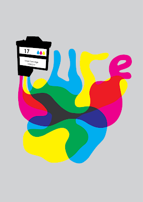
After the final crit I made a few small tweaks to the design of mine. The biggest was on the ink cartridge in my poster, I removed an unnecessary black dividing line so it looks slightly more like a 'P'. I'm still not sure if I should have gone for a white background instead of the gray, I printed both and asked some opinions but couldn't decide so I left it as it was.
Anyway, click on the box below to go direct to my poster on the Don't Panic site, or click here for all the 'pure' entries.

It will be really cool if someone from our group wins this as there are some really nice entries, we will have to see.
After the final crit I made a few small tweaks to the design of mine. The biggest was on the ink cartridge in my poster, I removed an unnecessary black dividing line so it looks slightly more like a 'P'. I'm still not sure if I should have gone for a white background instead of the gray, I printed both and asked some opinions but couldn't decide so I left it as it was.
Anyway, click on the box below to go direct to my poster on the Don't Panic site, or click here for all the 'pure' entries.
Sunday, 1 March 2009
Dont Panic, competition brief : Pure Poster
Wow, a live brief! I have really enjoyed working on this one because I do like the Don't Panic posters (I have 4 up in my room right now). I wanted to follow the basic style of what I would expect from a Don't Panic poster: Simple illustration in a bright and immediate style. These arn't especially deep but are always visually engaging and the best ones have a cleaver twist on the chosen theme. This months theme is 'pure' and of the ideas I had for it the one that had the best response from the crit was the idea of pure CMYK ink leaking from an inkjet cartridge. I played around with this theme and in the end I have the ink catrage and ink spelling out 'pure' and also mixing into the secondary colours. I am pretty pleased with the way it all came together, its not as good as it could be, but its as good as my illustrator skills can make it (I wanted to do more with the ink and I did try a few techniques to make it look more liquid but I just couldn't get it to look right)

Wednesday, 25 February 2009
What is a line: rethought and reloaded.
Well... I came to a bit of a dead end and got a bit fed up with this brief but we organized a mini crit yesterday and now have a completely new direction! Amazing, a crit that worked! I was going to base this on long exposure and photography but the sketches I was doing were all typographical so I am now going to explore that instead. Luke gave me a great tip: http://www.artyulia.com/index.php/Illustration# (The images won't copy over so you will have to click to the site) Some great work using paper curls to make 3D letterforms, that bear a resemblance to my sketchbook letter doodles, so I am going to try to see what I can make using strips of paper as my 'line'. I think this will be quite a neat interpretation of the brief if it works, and something much more crafty that I would normally try to do.
Also I am still going to have a go at pixel stretching as an alternative solution, Gareth has started some interesting work but has since moved on in another direction for his project. I want to at least learn this technique even if it leads nowhere for this brief. (click for gareth's blog post)
 (Main inspiration: pixel stretching Designers Republic style, nice!)
Also I am still going to have a go at pixel stretching as an alternative solution, Gareth has started some interesting work but has since moved on in another direction for his project. I want to at least learn this technique even if it leads nowhere for this brief. (click for gareth's blog post)
(Main inspiration: pixel stretching Designers Republic style, nice!)
Sunday, 22 February 2009
Ana Serrano
This is great, I found Anna's work in an issue of step (a magazine I wont be buying again by the way, some good work featured but the articles are crap if you actually sit and read them!). Anyway Anna is a fresh artist/designer graduate from LA and has a fresh style that is really sweet and appealing, lots of 3d work that is still very graphical somehow.
The big 3d town thingy is just awesomely cool!
http://www.anaserrano.com/ANA_SERRANO/home.html


Oh and she has a blog as well, which is blatantly better than mine, grrr
http://www.okbyeblog.com/
The big 3d town thingy is just awesomely cool!
http://www.anaserrano.com/ANA_SERRANO/home.html


Oh and she has a blog as well, which is blatantly better than mine, grrr
http://www.okbyeblog.com/
Subscribe to:
Posts (Atom)