

Sunday, 1 March 2009
Dont Panic, competition brief : Pure Poster
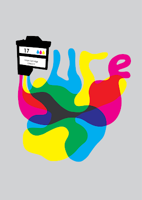
Wow, a live brief! I have really enjoyed working on this one because I do like the Don't Panic posters (I have 4 up in my room right now). I wanted to follow the basic style of what I would expect from a Don't Panic poster: Simple illustration in a bright and immediate style. These arn't especially deep but are always visually engaging and the best ones have a cleaver twist on the chosen theme. This months theme is 'pure' and of the ideas I had for it the one that had the best response from the crit was the idea of pure CMYK ink leaking from an inkjet cartridge. I played around with this theme and in the end I have the ink catrage and ink spelling out 'pure' and also mixing into the secondary colours. I am pretty pleased with the way it all came together, its not as good as it could be, but its as good as my illustrator skills can make it (I wanted to do more with the ink and I did try a few techniques to make it look more liquid but I just couldn't get it to look right)
Subscribe to:
Post Comments (Atom)
No comments:
Post a Comment