First up a test piece that I quite liked, a 3D lettering experiment with strips of paper
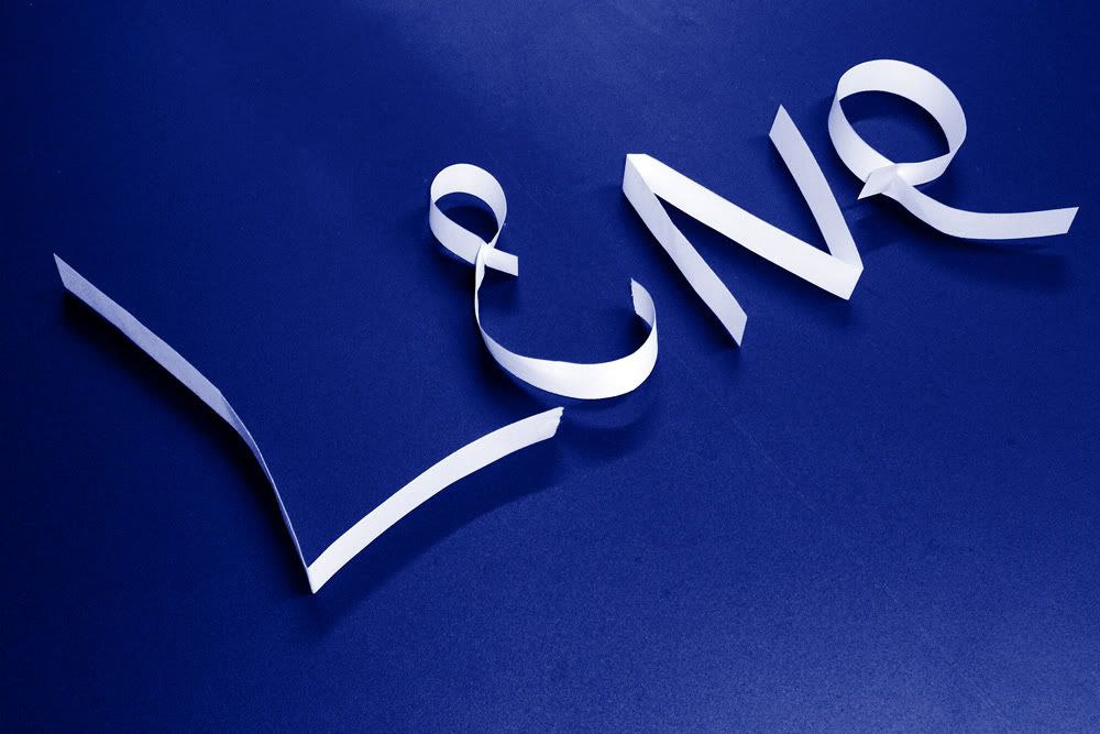
The photograph was enhanced somewhat in photoshop but I wanted to keep it looking fairly natural.
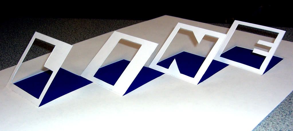
This is the piece that eventually became the insperation for my final resolution, hand cut lettering in 3D
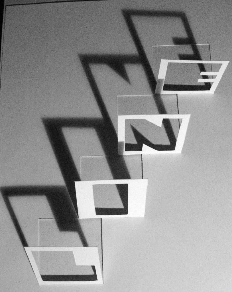
I realised that the shadows that were cast if I got the light at the correct angle added an interesting extra dimention to this so I played around with this photograph...
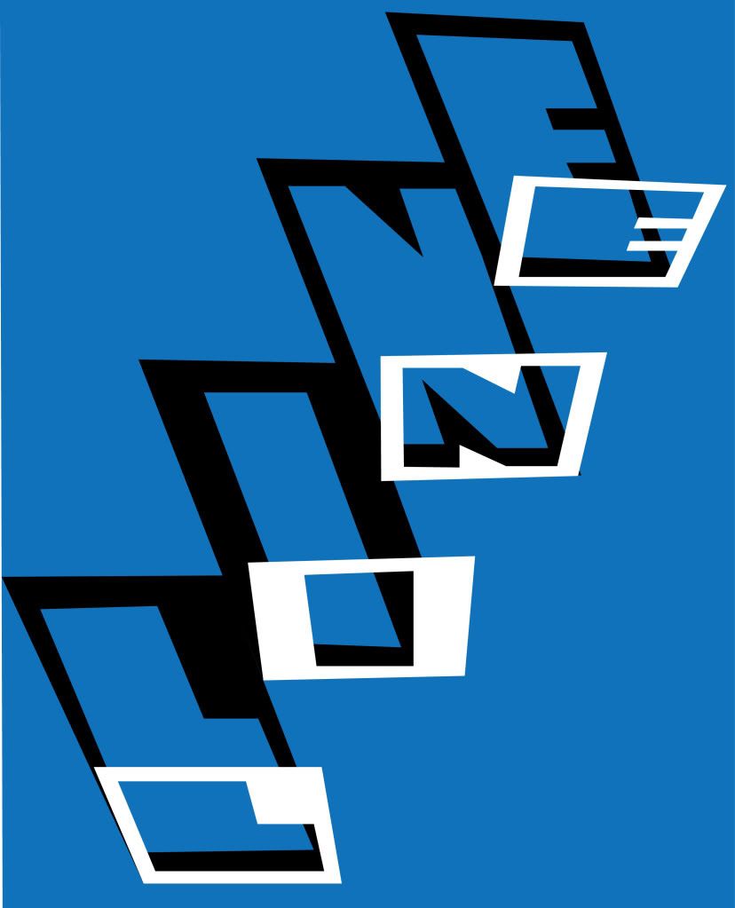
...And created this by tracing in illustrator. I was pleased with this, it has an unusual visual effect.
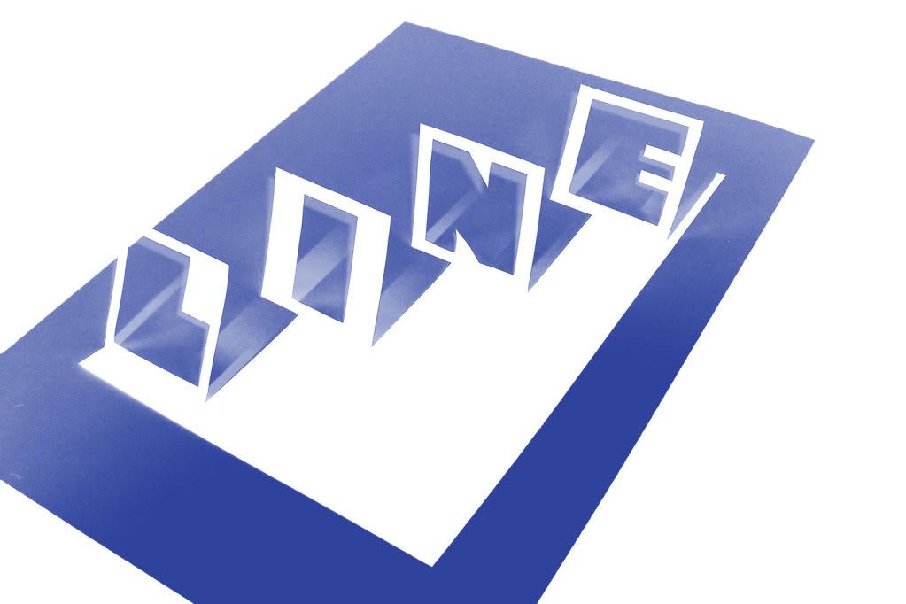
This was another test piece using a different photograph as a starting point and Photoshop to enhance rather than Illustator. At this point I was worried I was straying too far from the brief and decided to create a whole typeface in this cut out style.
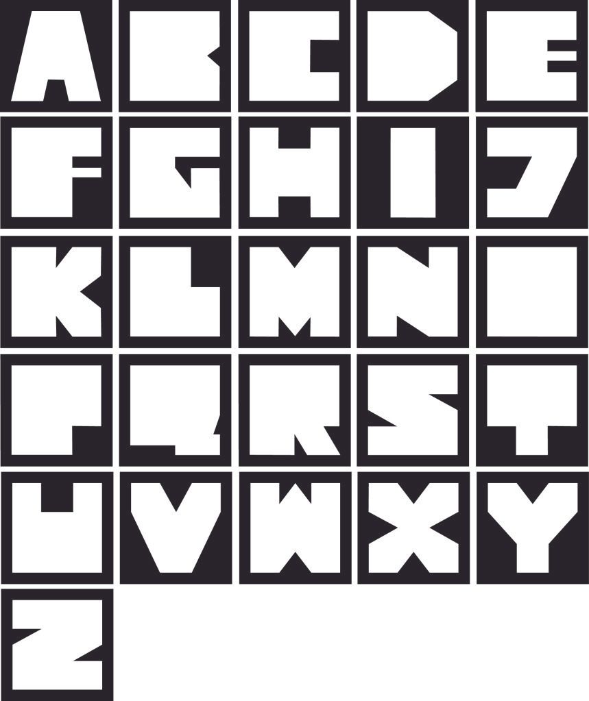
This was the result, I liked this but I didnt want to lose the 3D element. I was desperatly running out of time by this point so I couldn't cut out and re-photograph these as I would have liked, so..
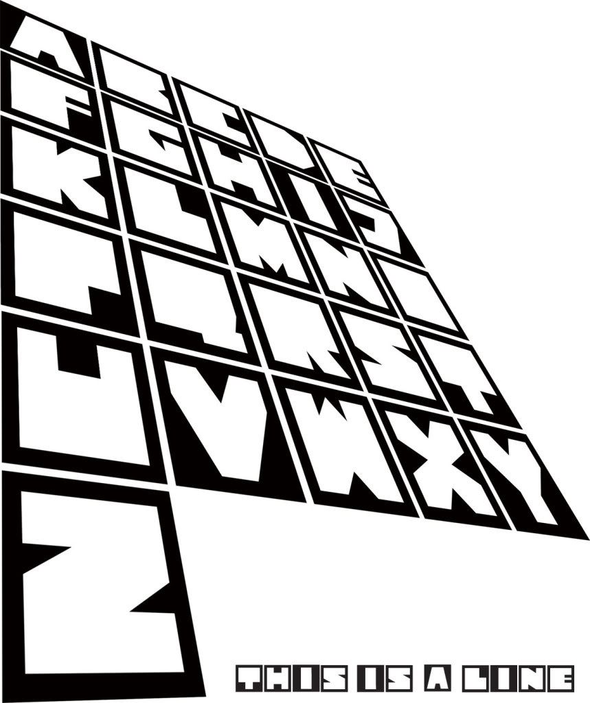
...I created this in photoshop to give a shadow/3D effect, this was actualy far more tricky than I thought because of the way vector objects are handled, but I wont go into that here. This is the finished resolution and I am happy with it because I feel this type design really developed for a reason, they are letters designed to cast a legable shadow when cut out. An odd reason but a reason all the same!

No comments:
Post a Comment