

FedEx t-shirt design
I cant find out much about this design so I'm not sure if its an official FedEx promotion or not, but either way its a great idea for a t-shirt. I am thinking of doing a t-shirt design my my project possibly but something less obvious than a normal print on the front so this got me thinking.

Mondo Pasta ambient advert, Agency: Jung von Matt AG, Hamburg.
This is a great idea for an advert that was placed onto ships in Hanburg harbor. There is defiantly a trend towards this sort of 'ambient' campaigns at the moment, they are defined by a creative use of the existing environment to promote the product. I'm sure I dont need to explain this one!
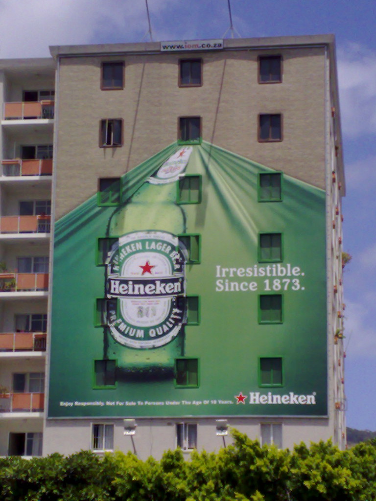
Heineken Cape Town ambient billboard
Heineken seem to have embraced this style of advertising as I have seen a few simeler to this around the internet, again it interacts with the audience by creating an interesting illusion involving the existing environment. As my Speaking From Experience project involves helping people find their way around Leeds, I have been thinking how I can use the existing environment to my advantage.


Photoshop Eraser T-shirt by Reece Ward
This is an interesting one, I chose it because it would interact well but only with a target audience (Photoshop users) This is approproate to my brief because I want to target next years intake onto my graphic design course. Using a design that only other designers would 'get' might be a cool idea, but has the downside of being quite geeky and introverted. Still, this is a nice idea and works well as a t-shirt design.
(available from: http://www.redbubble.com/people/reeceward only £14.61)

Schulze & Webb 'Here and There' NYC map
Finally my personal favorite. I think this is the perhaps the best map design I have ever seen, it is visually stunning working as both a 3D and a 2D map at the same time. It is also (fairly) practical to use, I have a feeling this will get copied lots, but for now there are just two version looking in opposite directions of Manhattan NY. I am looking at developing more interesting mapping for Leeds but I am not going to try something this ambitious!
http://schulzeandwebb.com/hat/
No comments:
Post a Comment