
So then, as most of my time of this brief was spent refining and developing my map, I thought it would be good to share some of this process on this blog.
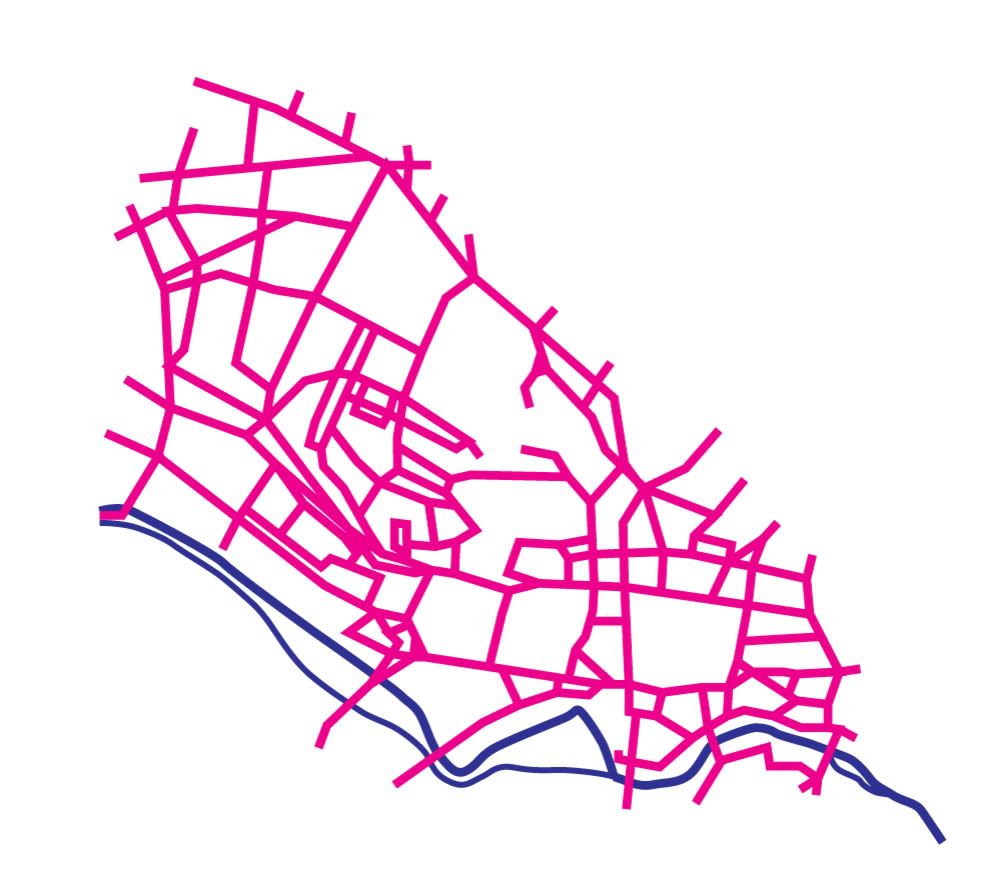
1) This was quite an early version but already I had made some decisions that were carried right through to the final resolution: To create a contrast between the roads and the river I used strictly angular connections for all roads and curves for the waterways. The thickness of the roads looked far too heavy and even if you know Leeds there is little in the way of obious points of reference here to help you find your bearings, so I knew I had to add much more detail somehow.
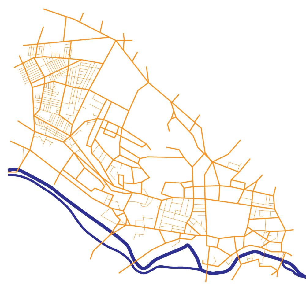
2) More detail added, including all the roads in the maze that is Hyde Park! I felt at this stage it was defiantly coming together well and the basic graphical style would work, this colour scheme also worked far better than the magenta roads I first imagined. Having two thickness for the roads defiantly worked better than one as the concept of major and miner roads is well engraved into our minds when we think of places and directions.
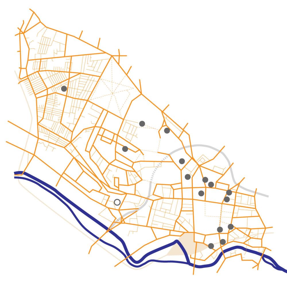
3) Even more detail added: Again the idea for a dotted line for a path is well understood so I Incorporated this in the city center pedestrianized area and also on parkland. The railway line was also something I wanted to add because it is a strong reverence point, but I didnt see the point in adding just one station so I wanted to make sure them map extended enough to add Burley station as well. This was the main reason the map includes so much of Hyde park, but as I was already thinking about tilting the map to show perspective I knew the Hyde park area would appear smaller in the final version. I thought hard about if I should include the main ring road as it is pretty irrelevant to students who walk around Leeds, but in the end I drew in in with semi transparency as it does serve as another point of reference to finding places in relation to each other in the city, I also dotted the underground section of this.
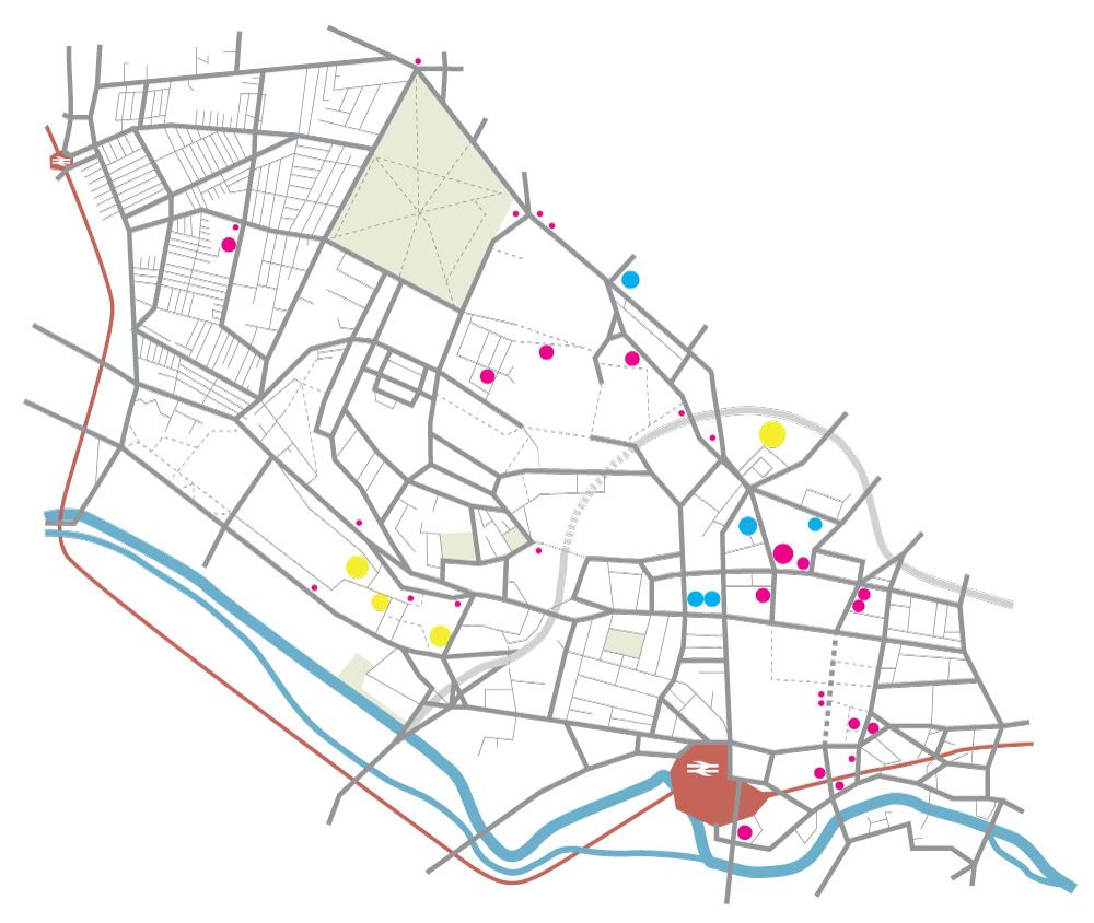
4) I didnt really want to add more colours that was strictly necessary, but adding in parklad as green really helped highlight Hyde Park, which is a major student landmark in Leeds, I also added the old British Rail logo for the train stations, cheeky yes, but its still universally understood and seemed to sit well on the map as its a simple angular shape. Also you can see places being added as dots here.
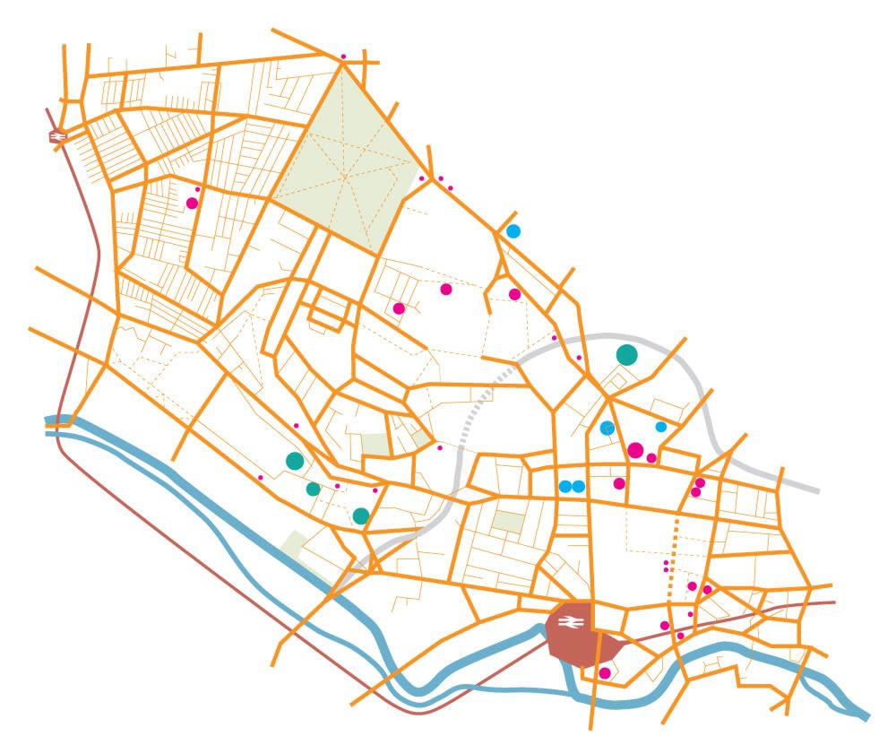
5) Another colour change: After a good hard look at the work to date, I decided the orange just wasn't doing it for me so I changed the roads to a mid gray, obvious choice really as this is the colour of actual roads.
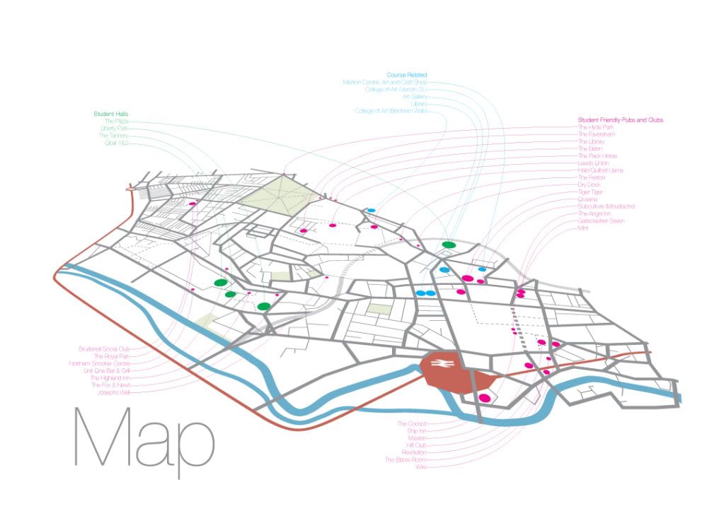
6) Final Map! I know this doesn't really work at this scale as it has been designed to be viewed close up as A2 scale but you can get the idea. Tilted back into 3D with tagging done lightly so not to distract from the map graphics itself. There are student halls, pubs/clubs and also some course related sites tagged as these were the places that my survey reveled this years students wanted to knew the way to when they started on the course. I did originally title it 'Leeds' but the I though that was pointless as it was never going to be anywhere else if it was given to students at a Leeds college, so I went with the minimal 'Map' as the title.
2 comments:
love this final map. definitely the best thing you've produced this year, from what I can remember. well done
Strength to strength my friend
look forward to seeing you around kendal
well done
andy H
Post a Comment